When Tátil Design creative director Frederico Gelli discovered that there were 138 other agencies competing to win the bid to design the 2016 Olympic logo, the first idea that came to mind was to simply give up. “I thought it would be impossible,” he says. The Olympic committee required a nearly-completed logo to submit, tough to do without even a single round of client feedback.
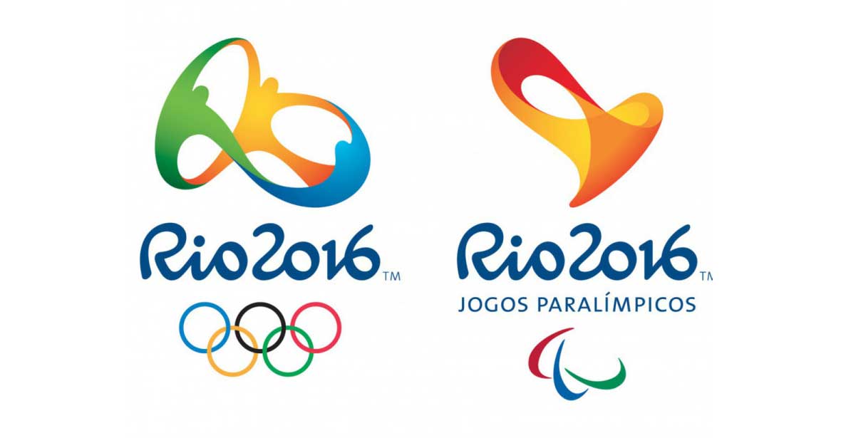
“I had the idea of the 3D logo when I was swimming at Ipanema Beach,” says Gelli “I was under the water, and when I came up, I saw Dois Irmãos (Two Brothers Hill, above). And I said, we are in the middle of sculpture city, we need to make a harmonizing logo. All of the curves of the logo shapes come from the mountains in Rio de Janeiro — not only the main one Sugarloaf Mountain, but all of the the mountains.”
On the Infiniti Design “This is an archetype. You can find this symbol in caves a million years ago and in children’s schools today. This make the logo so strong because it has a good meaning in all the cultures — with union and force. People see a lot of different meanings in it that we didn’t intentionally put there. The mayor of Rio said he could see Rio in it,” Gelli says with a laugh, “What?” On the Importance of Using 3D Modeling in the Process Although Tátil had a 3D concept from its earliest sketches, the logo was born as a graphic representation since this would be its main application. Once the team got to the logo’s final shape, however, Tátil jumped back into 3D modeling to see what the logo would look like in 3D form and discover new possible applications for the form. “We wanted people to be able to see the 3D essence in the 2D version,” explains Gelli. On the Color Pattern “We have a very colorful city and culture. The colors are connected with our nature. Green is connected to our nearby forest, Tijuca Forest, one of the biggest in the world. Blue represents our ocean that inspires us. And the yellow/orange comes from our warm temperature.” The Biggest Challenge With the logo solidified, the next step was to design a limited logotype character set. The entire typeface would be fleshed out by another firm, so Tátil had to focus on an elegant but visually compatible accompanying “Rio 2016.” “In the beginning we had a strong logo symbol, so we decided to make the logotype really clean without personality to create a stage for the symbol,” says Gelli. “The logo was the protagonist and the type set it up to be the star. But the feedback from the Olympic design committee was for our logotype to have the same DNA as the logo. So we hired an expert typographer to join our team and we drew 150 different logotypes on paper to see if we could find one that had the same DNA of the symbol — the curves, the nature, the drawing of the logotypes — before we chose the current one.” II. The Font Roughly 18 months after the Rio 2016 logo was developed by Tátil Design, Dalton Maag got the prompt to design the full font. Dalton Maag’s meeting was held with James Bond-esque secrecy. The company’s creative director Fabio Haag thought he was going to talk about a corporate design project, only to be told at the table that this project was actually for the upcoming Olympics. “Our prompt was that the font had to be an exact replica of the letters in the logo,” says Maag, who knew it would be a challenge due to its reverse creative process. “Usually you make the font and then do the logo,” he notes. Dalton Maag had 3 letters — R-I-O — and 4 figures — 2-0-1-6 — to use as a roadmap. Here is how Haag and his six-person team built the rest of the 2016 alphabet and special characters — nearly 500 in all. The Challenge “The difference between a logotype and a font is that, in a logotype, the letter combination is set, but in a font, every letter needs to work nicely next to any other and match,” says Haag.“In the logotype, some characters are very fluid, like the ‘R’ and the ‘2’, but the ‘1’ is very straight and the ‘o’ is on a steep angle. Finding a balance that would work as an harmonious system was our biggest challenge.” How Dalton Maag Began “You could say, we already have the letters ‘R,’ ‘i,’ and ‘o’ and we want to make letters that look like them, so we could just expand on them. But the tricky thing is that we can’t use the same letters because they might not connect, or have the same weight and proportions, as with the rest of the letters in the alphabet. So we started using different words — ‘passion’ and ‘transformation’ — that had multiple ligatures to see how one letter could connect and match with another.” “Choosing the right words was key to the success of the concept,” continues Haag. “Here you have ‘passion,’ and below it you can see a lot of similarities in “Rio 2016.” We then came up with 23 different font concepts and started comparing them to one another using “passion.” Then, on the 24th concept, the hero concept, we used the word ‘transformation,’ [Transformação] because it is a triple ligature of ‘s,’ ‘f’ and ‘o,’ which plays off the ‘1’ and ‘6’ of the Rio 2016.” Troubleshooting “Another big challenge was to refine how the letters connect, like if there was one unit difference, it was not good enough. I would make really big letters on large prints, then change the connection between letters, and then go back to the computer and make the change on the smaller font. In order for a font to look like it was hand-written and spontaneous, we created a lot of alternative characters. There are two versions of ‘b,’ ‘d,’ ‘p,’ and ‘g’ and the version that is used is based on what letters precede and follow it, so the connections look natural.” The Importance of Sketching “In order to figure out how the font should look, it was important to understand how it was written. We realized that replicating the logo is not about writing a certain thing with a pen, but about brushstrokes and large movements with speed. For example, the ‘n’ is like a wave. Anywhere on a classic script font you would have a trace, like a stem, and then you would go back and make a join — there is no subtleties, no small curves. Everything is big and large. Going through the paper exercise was very important to see how the original logo was written and to find out the rationale behind it, to see how it resulted in those letters. III. The Takeaway “On this project we were extra careful to be super right, because it will be seen by billions of people. But we didn’t treat the project any differently than others were work on. I thought we would nail the concept much quicker, because we knew the design and just needed to expand on it. We didn’t realize we would have to create 23 different versions to get there. The font is property of the client, as it is a key asset of their identity, so it cannot be licensed. That said, we quoted this as if it were any other project for a private company and got paid properly.” Read the full article here. Matt McCue is the senior writer for 99U. Previously, he contributed to Fast Company,Fortune and ESPN The Magazine. He lives in New York City, but he is willing to travel long distances for a good meal. Find him here @mattmccuewriter.