SN2E is a commercial company that provides management and commercialization of intellectual property services for all Israeli colleges, research institutes and hospitals.
SN2E was chosen three years ago by the Council for Higher Education to manage the intellectual property of more than forty government institutions, and there is a lot of action there: academia in Israel is relevant to every field that you only imagine – textiles, medicine, industry, biochemistry, marine biology and what not …. really endless fields and inventions.
So what are they doing in SN2E? They bridge between the academia to industry. SN2E examines thousands of inventions and new products that are developed in the academia, assesses their business potential (if any) and manages the whole process of commercialization, up to the acquisition. This is a long and complicated process that requires expertise in many areas of research, understanding of the world of patents and intellectual property and requires sales expertise.
So what do we have to do with it? Well, we were asked to brand a company that deals with a field that is not in the public consciousness, usually managed within the walls of academia, but in the end it sells products like any other company. It sells intellectual property.
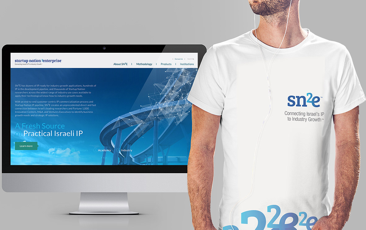
In a joint strategic process with an American team (SN2E sells its intellectual property worldwide), we developed the company’s messaging, created a new visual identity and set up a new site for SN2E.
The process was interesting and challenging – on the one hand, SN2E’s clients are the academic institutions – they should be given a place, appropriate representation and relevant content. On the other hand, there are potential investors – they want to know about each invention, who developed it, what its commercial potential, and more.
At the end of the strategic process, we approached the development of the company’s brand identity. The new design language conveys the brand’s values: expertise, dynamic, futuristic and simplicity. The new visual branding uses a clean typographic language that is expressed in the design of the logo, combined with technological images and the image of a bridge that symbolizes the brand’s strength and robustness as well as the connection between the academic world and the world of technology, entrepreneurs and inventors.
At the end of the strategic process, we approached the development of the company’s visibility. The new design language conveys the brand’s values: expertise, dynamism, future progress and simplicity.
The new visual branding uses a clean typographic language that is expressed in the design of the logo, combined with technological images and the visual of a bridge that symbolizes the brand’s strength and robustness and the connection between the academic world and the world of technology entrepreneurs and inventors.
Read a post by Ornit Sade-Benkin regarding this project on Stratigo’s Blog.
Technology, B2B
SolutionsUX / UI, e-Branding, Web Design, Web Development
TechnologyOpen-Source, HTML 5
Visit the Live Site